Hi! I am Adil Ashraf – Based in India
Creative Designer, Graphic, Web, and UI&UX
About
I’m Adil Ashraf, a freelance UI/UX designer in Kannur, Kerala. I design clean, easy-to-use digital interfaces for local products and small businesses, helping them look premium and stand out online.
I work in Figma, Photoshop, and Illustrator, and I hold a Certificate in Graphic & Web Design from Opentutor Design School. My background in poetry and cartooning gives my designs a strong sense of expression. If you need an interface that’s simple, polished, and built around your users, I’m ready to bring your vision to life.
Services & Tools
My Works
Casestudies
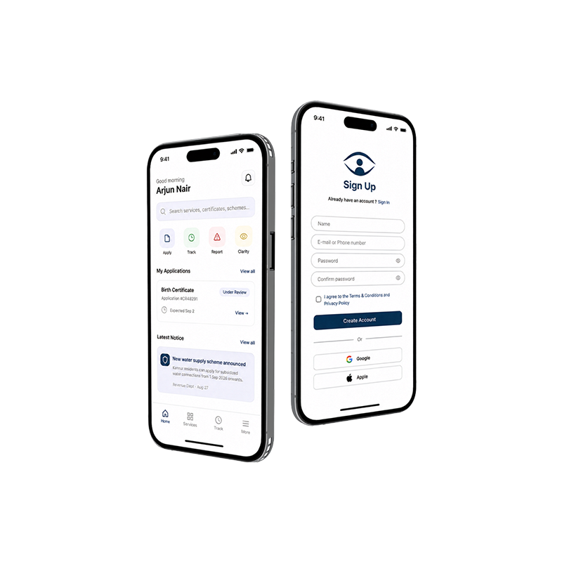
Drishti
A civic-tech app for government services
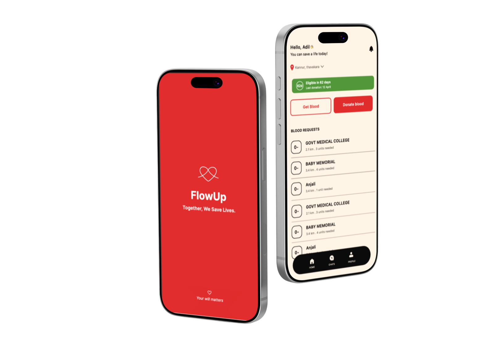
FlowUp is a mobile app that connects blood donors and people in urgent need through one trusted, real-time platform. Donors get alerts when a nearby request matches their blood type, and requesters can post a request and chat with a matched donor in minutes. No phone trees, no forwarded posts, no guessing. Together, we save lives.
Flow up
Blood Donation App
FlowUp is a mobile app that connects blood donors and people in urgent need through one trusted, real-time platform. Donors get alerts when a nearby request matches their blood type, and requesters can post a request and chat with a matched donor in minutes. No phone trees, no forwarded posts, no guessing. Together, we save lives.
Logofolio
ZOLT energy drink
ZOLT is a clean-energy drinks brand that offers a fast lift and a smooth finish in 3 flavours: Grape, Mint & Lime, and Berry.
ZOLT has a bold, slanted wordmark style with sharp diagonal cuts through the letterforms, creating the feel of speed, charge, and electric energy.

Aurelia
Auralia is a fine jewellery brand identity built around quiet luxury. The monogram interlocks the letters “A” and “U” in a single flowing form, where the curve of the “U” becomes a teardrop, like a gem catching the light, and a fine hairline diagonal extends from the “A”.
The wordmark pairs a heavy high-contrast serif with sharp terminals and delicate hairline details, in a burgundy, gold, and cream palette that evokes candlelight and old-world jewellers.
Evercare
Evercare is a healthcare brand identity built around lasting, compassionate care. The wordmark pairs a warm, rounded sans-serif with a custom “e” and “c” — an infinity symbol nested in the “e” for endless commitment, and a small leaf in the “c” for growth and healing.
Evercare uses a clean, approachable wordmark with soft terminal curves, paired with a deep teal, white, and green palette that feels calming, clinical, and trustworthy—built to work across signage, uniforms, ID cards, and print collateral.
Package design
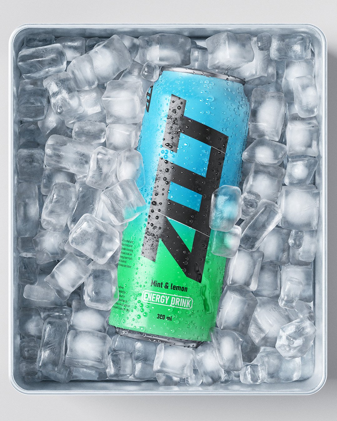
ZOLT Energy Drink
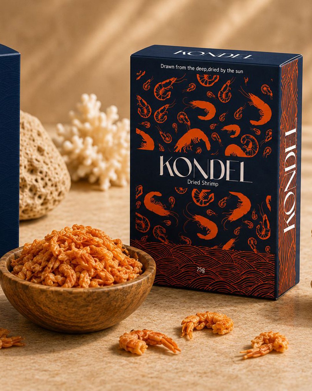
Kondel Dry Shrimp
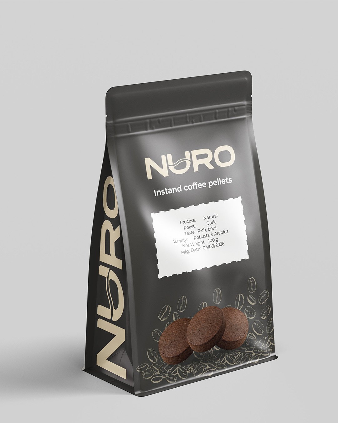
NURO coffee pellets
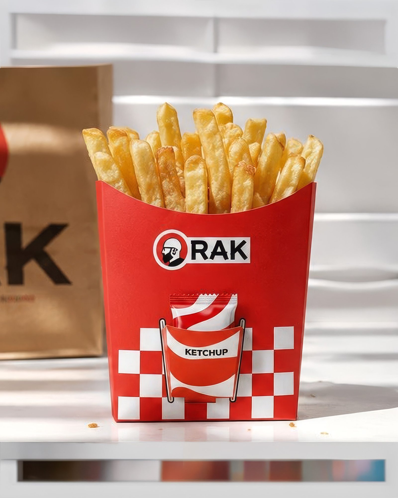
Integrated ketchup pocket